Perhaps your furniture taste leans toward Danish modern and you have a thing for bold, graphic area rugs. You can pick out upholstery fabric from 10 metres away and set a table so pretty it would make Martha Stewart weep. But when it comes to choosing a wall colour, you’re stopped cold. You are not alone.
I knew a woman who put less thought into her wedding dress than she did her choice of paint shades. Paint is one of the easiest things to change about a home but it’s also one of the most daunting decisions for many people.
“It’s human nature to play it safe, and this includes paint colour choices”, says Martin Tustin-Fuchs, Brand Manager, Dulux Paints.”You can think of fashion the same way. Many people opt for the security of basic colours such as black, grey and tan tones for their wardrobe, but we all know that wearing a pop of colour can make an outfit more attractive. The same goes for walls.”
Like a dated hairstyle or a favourite old pair of high-waisted jeans, we can find ourselves in a colour rut that’s hard to leave behind. There are shades that simply scream out their decade. See Pepto-Bismol pink and anything named seafoam or moss and you’ve returned to the 1980s faster than Doc’s Delorean in Back to the Future. Today, those colours make a house look more like a museum. You deserve to buy yourself something new once in a while. Tustin-Fuchs says a fresh colour will even make older furnishings appear more up to date. “Paint is the least expensive decorating tool around.”
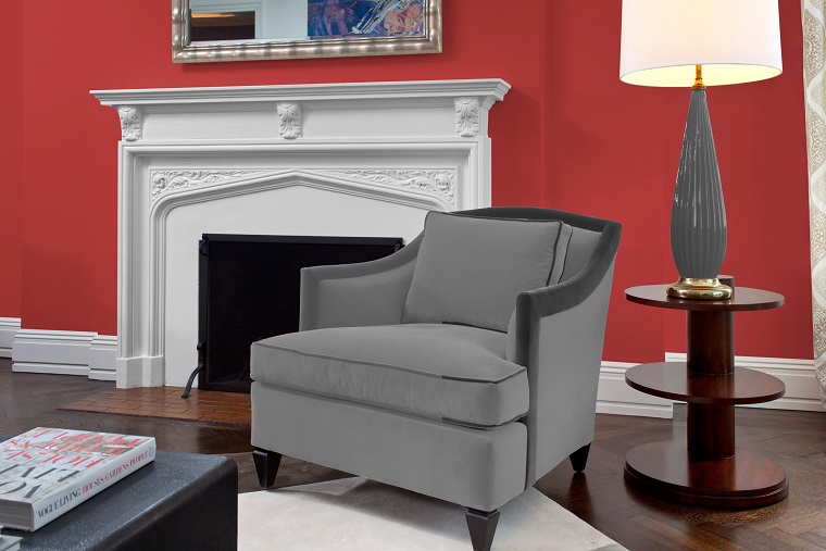
Years ago, living in a century home, I chose a deep red for my living room walls alongside high baseboards and crown molding in crisp white. Friends and family thought I was daft and when I saw how those old walls drank the paint, and how many coats it took by a pro to get an even finish, I’ll admit I had a brief crisis of faith. But the end result was stunning and I spent more time in that room when it was red than I ever did when it was Firewood Tan, or whatever the boring, previous shade was called. It simply made me feel good and that’s what our surroundings should do.
Whether you’re considering a change or starting from scratch with a home full of “builder beige”, colour choices are nothing to rush into. There’s more to it than just simply putting your favourite shade on the walls, especially if you’re partial to cool blue and want it in your bedroom. It’s a colour that’s more conducive to eating and entertaining, so unless you’re moving the dining table next to the bed, it’s best to do a little research first on the way colour affects the mood.
Another mistake to avoid, according to Dulux, includes choosing a colour without considering the light in the room, and how well it works with your furnishings.Those little paint-chip walls are under bright beams of light and your room’s ambience is likely a little softer. The company offers free advice with a Paints Colour Visualizer online that allows you to upload a photo of your room and have the software make suggestions. (www.dulux.com) It’s a terrific starting point.
In our home, we’ve stuck mostly to neutrals and decorated with pops of colour in accessories and furnishings but now I’m remembering how inviting that red room was and thinking that perhaps it’s time for a change. Life is too short to be always surrounded by beiges.
If red is in your future, just leave it out of the bedroom. Leave your expressions of colour to your main rooms and borring to the bedrooms, at least if you want to get a good nights sleep.